Welcome!


Hello, I'm
Matthew Romo (1660) from Group 2. The other embers of my group are Harry Kettenis (0390), Josh Stevenson (0796) and Ysabel Hudson-Searle (0331).

Hopefully navigation should not be an issue on my blog; 'labels' on the right hand side near the top will direct you to groups of posts from specific areas. Research and Planning, Production, and Evaluation work should all be available to see under their respective A2 labels. The other labels will direct you to work from my AS level and preliminary activities for A2.

Also, by clicking on the "Latymer Music Video Blog" link above the labels, you can go back to Latymer's main music video blog where all other blogs from my class can be accessed.

Finally, I hope you enjoy observing and assessing my work as much as I did creating it.


Our Digipak Cover

Our Digipak Cover
Our Digipak Cover

Our Website

Our Website (Text)

Our Website - Click on the branding above to enter

Our Music Video

Our Music Video (Text)

Our Music Video

Monday 5 January 2015

1) In what ways do your media products use, develop or challenge forms and conventions of real media products?


Our group's music video, album cover and website combine the use, development and challenge of the conventions of real products. Most of this occurs within products of PBR&B and similar music genres (rap music, R&B, etc) but other aspects reflect or contrast convention on broader levels such as gender representation in the industry.


Music Video

Theorist, sociologist and critic Simon Frith stated that music videos fell into the categories of "Performance, Narrative, and Conceptual". Our music video utilizes characteristics of all of these, with the purpose of promoting the artist and leave a lasting image to associate with Roza and her music.


Although not comparable in terms of genre, Fall Out Boy's music video for Sugar We're Going Down was one of my personal early inspirations for wanting to incorporate all 3 typologies as theorised by Frith, as their music video does this also:


Performance
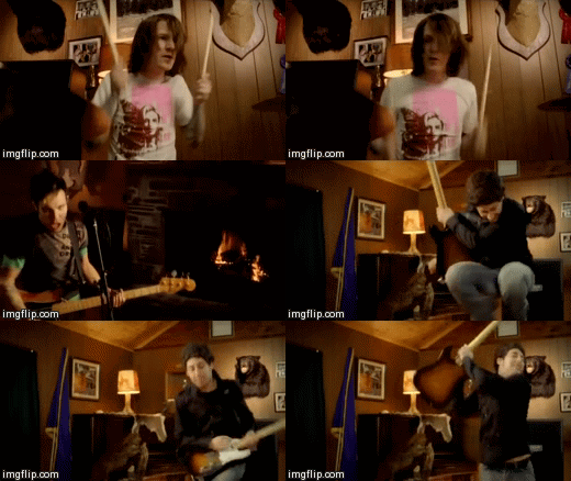


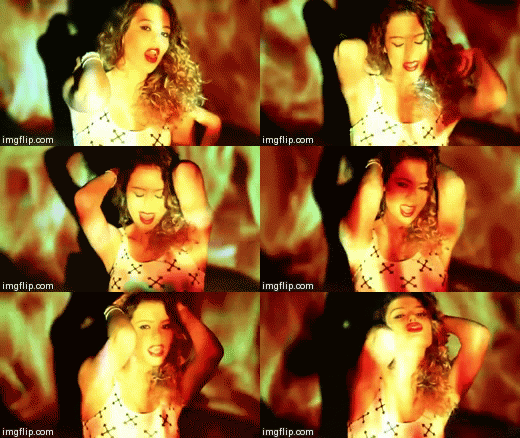
Fall Out Boy establish a punky, energetic band image through performance, whilst ours is slow and smooth, providing the image that Roza is cool, confident, 
and passionate. Lip-synch and dance are concepts of performance music videos that we have adhered to, all the while trying to convey a specific image of the artist, as videos do. For example, the fire represent her fervent, emotionally driven nature but combined with confident facial expressions they provide challenge to the archetypal submissive female which is prominent in the media. She may be effected by what is happening in her life but in many of our shots Roza is portrayed as a strong, powerful figure.


Concept


The main character having horns is a clear visual motif for being different, and being alienated because of it in SWGD. It is used as an extended visual metaphor, and similarly in Teen Spirit we used the silhouette shot to represent paranoia and fear, and the back shots to display the emotional effect of her relationship on her in words, to give two examples.


Narrative
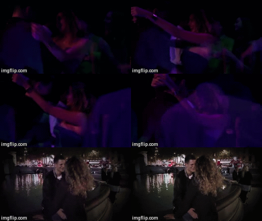


Both narratives are about a relationship having ups and downs, and these are told through a series of montages separated by performance - a convention of hybrid videos which we use in order to play into the audience's expectation. Keeping within certain conventions is essential in order for the audience to be able to understand the video.

The positive parts in both are cut more as a montage whereas the negative parts were cross cut with passionate performance in order to exacerbate the feelings of empathy with the character in the video - for us it is our artist. In doing so we apply Katz and Blumler's Uses and Gratifications Theory, as audiences actively seek to be emotionally synchronised with the characters to relate to them and their everyday lives.


Representation

I believe we provided alternative representation for women in music with Roza's character and how she is portrayed. In so much music today, female artists and females characters in music vide
os are so commonly sexualised and displayed in a voyeuristic way. 

 
Nicki Minaj in 'Anaconda' - an all too common use of
hypersexualising female body as a means to sell music.


This is done by shots focusing on specific body parts such as the bottom and chest with pans and camera movement on the body, however with Roza we aimed for her to be appealing in terms of appearance but not sexualised, as is an increasingly common convention of the music industry. 
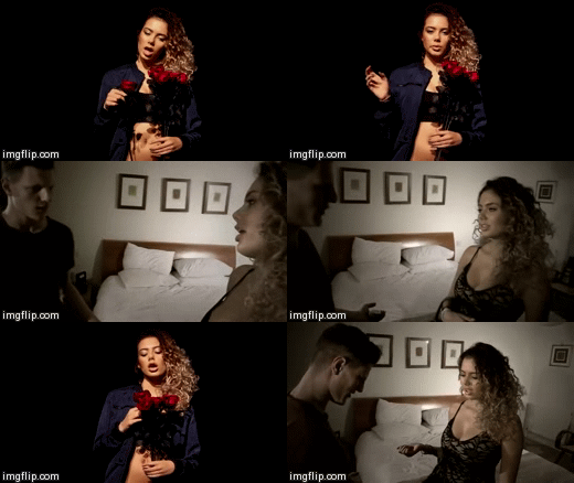

Throwing roses aside scornfully in relation to an agument
in the narrative


We wanted Roza to be appealing and attractive, but also to humanize her by giving her a story within the video. In Teen Spirit, she has thoughts and feelings which are portrayed not only through lyrics but a relatable narrative and in how she performs simultaneously in relation to it. PBR&B lyrics are mainly about relationships so we made our video in accordance with this.


                                           Lyrics in PBR&B from latymermedia2013


Roza is also shown to stand her ground and be fairly tough, displaying some masculine qualities which empower her as a female character; despite going through a lot and being effected she still sticks up for herself.


She slaps her boyfriend for being unfaithful, walks out when he appears to be disapproving of her going out, and often has an powerful air of conviction in the performances where she holds the rose. We challenge conventions of voyeurism and sexualisation and counter them with a strong female artist more towards the likes of someone like Beyonce.


Style


We also took inspiration from Beyonce in terms of having powerful closeups like this one:
Makeup for this shot was inspired by Beyonce's If I Were A Boy video, aiming for a 'wet' look


Website


Our website took a mixture of inspirations from similar artists within the PBR&B genre, mainly The Weeknd and Jhene Aiko.


Uses Conventions


The bio I wrote for the Roza's website


Having a poetic styled bio on our website conforms slightly to the convention that female artists are more emotional and expressive of this, to give the example of Jhene Aiko's website, which we took influence from.


Develops Conventions

The convention we found with PBR&B artists was that conventionally they would be very minimalist, and this element to their style made them very cool. Browse any of the websites from JMSN, The Weeknd, HowToDressWell, FKA Twigs, Tinashe, Banks, and Jhene Aiko and the simplistic but very visual characteristic of them is evidently consistent throughout the genre. However it is conventional for new artists as a whole, particularly within the mainstream, to need to do more, with lots of images of the artist to showcase their identity and advertise their music and merchandise to further develop this.

We developed this music industry convention by combining it with the relatively new characteristics of the PBR&B genre, which has only really existed for a few years. We felt this is an effective way to be current and trendy as well as leading to more potential for artist success, having so many ways to interact and get involved with Roza and her music, or at least in the way they are laid out clearly on our homepage as seen below:

Confidence in terms of black and white colour scheme like The Weeknd but also quite interactive like R&B artist Misha B's website.  


Album Cover

Our digipak cover conforms to PBR&B conventions  by having an image of the artist as the centerpiece of the cover. This is important to do especially for debut artists as they are establishing themselves for the first time and will aim to do this positively. 


When looking at a multitude of album covers within the PBR&B genre, we observed the general trend of having quite cold colours on the spectrum, JMSN and James Blake's eponymous album covers being a good example. On many, colour had been muted towards black and white and grey, probably through editing, with FKA Twigs's LP1 being a rare example of visual vibrance. This observation gave us the opportunity to stand out among the genre with eye-catching reds, since it is the colour that arguably shows up most distinctive among the black and white scale.

                             
                                      PBR&B Album Covers from latymermedia2013

I made a SlideShare presentation to show some of the album covers mentioned. Flicking through gives a fairly accurate and representative idea of album covers in the genre


Since the genre is made up of other genres, such as soul and hip hop, the inspirations were took from this variety of areas. With fashionable urban style clothing similar to Tinashe, empowering beauty shots similar to Beyonce, and visual style through our album cover and website inspired by the broad range of artists PBR&B contains, our products use many conventions that are elemental within our genre of music. But we developed these using some of Steve Neale's ideas of genre - that to be a successful product some aspects would have to be recognisable to previous ones but also make changes to stay fresh and exciting to the audience. Having a powerful, unsexualised female within a male dominant, objectifying genre provides that main difference that can make her a positive aspirational figure for females within our audience but still be appealing to males as well.


Sunday 4 January 2015

2) How effective is the combination of your main product and ancillary texts?


I feel that together, the amalgamation of our music video, album cover and website are quite effective for a number of reasons. These include synergy of consistent themes and styles across the products, and following modern trends as the music video has developed. Despite this, there are of course ways in which they could be improved.


Logo

Mind Map created by mattromo with ExamTime

Our branding is a strong part of what makes Roza's marketing something that could have real potential for success. Press play and slide through the ExamTime presentation above to explore the repeated use of Roza's unique logo. It is present across all aspects of the artist as a product:


  • Twitter
  • Live tour
  • Album cover
  • Website
  • Merchandise

Colour Scheme


Along with an ever present logo, we consistently kept to a colour scheme of black, white and grey with splashes of red as part of our release campaign. Having this and repeating it deliberately makes it more likely to imprint the image into any audience member's mind, along the same lines as associating the colour purple with Cadbury's chocolate, but a combination of purple with yellow might draw out the branding of UKIP in some minds; combinations of colours presented in certain ways mean things to us subliminally.


Mood board made by taking shots from the music video

The mood-board (above) that I made shows some of the aforementioned colour scheme consistency. Black and white dominate, alongside many greys, while powerful strikes of sharp colour fit the deliberate style of this video. This is replicated across the campaign, along with the branding, for example with the website:


Homepage

Store

Also on the Instagram account. This is a place where artists such as Rhianna and Beyonce will display their personalities through colour and images - we make Roza come across as quite arty, and again the black white grey colour scheme with dashes of colour (mainly red) reflect her spontaneous and varied personality, taken further on the website with her artist bio 


Even on the promo shots - the consistent colour scheme taken very seriously. Also a mix of facial expressions and poses from confident to fearful continue to indicate to the audience that there are many sides to Roza; this is a deliberate choice to portray her as a complex character


The album cover demonstrates the same attention to artist image. All 3 artefacts and each part of them were created with an awareness for branding in mind.


The rose was decided as a distinctive visual motif for Roza early on since it cleverly worked with her name and, also with the music as a symbol representing love and emotion. These powerful connotations link the visuals with our artist's personality and her music. This can be seen above in this blog post through the website, parts of the music video, promo shots and album cover.

This, and all of the above plays into Dyer's idea that performers in the industry will strive for immediate star identity straight from the first album/release. This personality and identity comes through more than just the song and lyrics but through consistent branding across the marketing campaign, to form a clear image in the mind of the audience. 
Richard Dyer's 'star' theory also states icons are created by media institutions to represent real people, something we took into account when constructing our artifacts for Roza, as every choice is deliberately constructed with marketing to the audience in mind


We maximised the potential success of our artist by ensuring our marketing campaign had a strong, clear brand, and was as interactive and cross platform integrated as possible to keep up with the modern trend of so much being accessible on mobiles and through the web 2.0. The proliferation of internet capable devices, and young people being renowned as the 'technological natives' most frequent to use this demanded we exploit as many opportunities within this as possible. Every intercative and social opportunity had to work together to promote our artist.

Saturday 3 January 2015

3) What have you learned from your audience feedback?


Our audience feedback has given us a great deal of information as to how we could improve our media texts during and after constructing them. We took feedback right across the construction stages, showing audiences our footage, video sequence edits as well as website and album cover. We assured that those we took feedback from generally within our audience of 16-25s and fans of the genre (which mostly coincide).


This avatar I created using the website 'Voki' gives an example of a member of the audience we are targeting:
                                                

Having a strong idea of our target audience meant that we could shape our products accordingly; the type of music trends they like and why, the things they like to do and what they like about particular artists.


This video feature 3 members of our audience providing feedback at a fairly late stage in the editing process, which we took on. We discussed some of our ideas to improve what we had.

To summarise:

  • More fades would be better during slower, calmer sections of the music
  • Cuts would be better during more intense periods with a stronger beat (previously we had overused fades as a method of changing shot)
  • The 'echo' type effect on the narrative did not really work. A sepia style grading could work better
  • We over-edited the hair flick shot and it could be simplified
  • Overall much of the edit was good in terms of creativity and seeming quite professional


After formally finalising our video, exporting it to YouTube, and uploading it to the respective blogs of my group members and I, we created a survey on SurveyMonkey to attain feedback on our music video. It attempts to gain an impression on people's consuming habits in terms of music and if they corresponded with their demographic i.e. age. After this is covered earlier in the survey, it seeks to hear the audience's understanding and reaction to our video, in terms of genre, what it is about, and how much they liked it and why.


Here is the survey embedded into my blog:

          Create your free online surveys with SurveyMonkey , the world's leading questionnaire tool.


The results data we received could have been more valuable if we were able to attain a greater number of results from a more mixed age range, however there was some interesting findings:
  • Most people taking the survey were female - female artist could appeal more to her gender if seen as aspirational. This could be different to the increasingly common convention of sexualised female artists whose appeal is strong with men 
  • Most people taking the survey were young people (16-24) - this was down to most of the responses coming after the video and survey were shared on social media, where people around my age would be the main viewers of this
  • The older respondents did not seem to recognise the genre whereas young people generally grasped that it was R&B or a sub-genre
     
Generally, people understood the narrative and idea of the video quite well and could clearly identify that relationships were a major theme (please excuse the expletive used by one respondent). The other responses were very similar.


Our qualitative responses were mixed but generally positive. A small number of people were not so sure about the song and some were not keen on the video in some ways. It is important to understand that almost no one will like everything, in the same way that everyone has different taste in music. The impression the survey returned was that some parts could have been clearer in terms of narrative and the way we used our shots, but overall the audience were fond of what we had made. 


As well as the survey, we also obtained video feedback, asking:

  • Did you enjoy the music video and why?
  • What do you think the genre is?
  • What is your opinion of the artist?
  • Explain your understanding of the narrative
  • Does it look professional?
  • What would you improve?


In conclusion, perhaps the most important results quite clearly identified our product as something that could potentially have success in the industry. This is demonstrated with 80% of people responding either 'yes' or 'maybe' when asked whether they would purchase the music after watching the video. Over 80% rated the video either 4 or 5 out of 5 in terms of how well it works with the song, and the most common response and also roughly the average when asked their rating out of 10, was 7. With almost 90% of respondents identifying themselves as 16-24 (our core target audience) and around a third of people saying they listen to R&B, and almost three quarters said they regularly listen to music, there is definitely a potentially strong market for our artist. 

Friday 2 January 2015

4) How did you use new media technologies in the construction and research, planning and evaluation stages?


As a group we embraced the use of new media technologies across each stage of the project, benefiting us significantly. This ranged from social media, which aided us at every single stage, to modern hardware, to digital editing software once footage was obtained.


Kit List
HARDWARE

Canon 5D Mark II DSLR camera

Canon HF G30 camera

GoPro Hero3 Black Edition camera with monitor

Canon 550D camera 


Canon DM-100 microphone

50in monitor

Libec TH-650DV tripod

Manfrotto 546b ball-headed tripod with 504HD head

Arri 1000w lights on studio rig

Ianiro Gulliver Lighting Kit (3x300w)

Leapfrog lighting desk


SOFTWARE
Adobe Creative suite - Premiere Pro, Photoshop, After Effects


Web 2.0

YouTube
SurveyMonkey
IMG Flip
Wix

Social Media:
  • Facebook
  • Twitter
  • Instagram
  • Whatsapp 
  • iMessage

Internet Shopping

  • eBay
  • Wickes


Research and Planning


Having young people as one of the main age groups of core fans of the PBR&B genre, it was appropriate to be led by social media in terms of marketing and releasing our artist and products, but also in finding out from the offset the kind of things fans of the genre might tweet on twitter as well as artists themselves.


Social media also played a key role in giving our group the means to communicate effectively; one of the first things we did once the group had formed was to set up a Facebook group.


Using this format we could share files, photos, and posts. Being teenagers ourselves, we were all connected to social media via both our phones, which, as is so common now, had 3G connection and access to web 2.0, and laptop/computers at home. This meant that outside school or while travelling for example, any one of us could post to the group, and thanks to 'push' notifications we would all be made aware and kept completely up to date.


Example of a post, setting an agenda of priorities to during planning stages

YouTube
Being able to access YouTube from almost any phone plus laptops, computers and tablets meant we could watch videos practically anywhere. We used it to watch other music videos for inspiration


We created a playlist of videos that inspired parts of our video or gave us ideas, in order to help keep our references together. Here is link to it.


Construction

Creating our actual products was completed with a lot of use of new media technologies

The Website, the internet and Web 2.0

With the proliferation of new technologies and increasing numbers of ways to consume products, we wanted to embrace modern trends to maximise the potential success of our artist by giving her the widest reach possible. To do this, we had to give our audience multiple platforms to consume content, that all link to eachother through the central hub of our website. We made this using the online website creation site Wix. Teenagers and young adults are the main audience of most PBR&B music and also the greatest users of social media, so our homepage would need to have as much connection with this as possible so our audience can connect and interact.


Circled are the many links to social media websites Instagram and Twitter, for which I made the accounts and posted 'updates' for fans and followers to see. Wix allowed us to embed these into our website, as well as an opportunity to subscribe to an emailing list - a huge number of mobile phones now have internet access, and can therefore connect to email too. Also on the bottom left, highlighted, is the scanner to use the mobile version we created of our website; to keep as up to date and current with the adolescent/young adult audience as possible we have not only had everything anchored in one place with the website, we have also made this all accessible via smartphone.  


Twitter

The Twitter account I made. It advertises our Instagram account, music video on YouTube, and our website, so that they all link together and are accessible through eachother


Instagram

The Instagram account I made for Roza. Again, the website and its merchandise store, as well as the music video and the Twitter are all linked and promoted from here too 


Despite having used premiere pro before, editing music videos was new to me. Being able to search the internet, and particularly YouTube when I was unsure how to do things helped me pick up some tips on editing specific to music videos, such as the example below, which breaks down editing to a beat.


The media department's technician was not always available to ask for advice so, as a student with at times less confidence in the software, I used the internet and its multitude of available resources to find online tutorials. A good example is when deciding (after feedback) to try a sepia style grading


A step by step guide I found and used to experiment with grading for our narrative shots


Knowledge I gained using this significantly contributed to the final outcome


Editing software

Adobe Premiere Pro was used to edit our footage together and grade it in order to create the music video. The software first came about
 in 2003 but CS3 which we used is far newer so it is fair to describe it as 'new technology'. (Photoshop created in 1988 but many more current versions have been made)


Evaluation


I used imgflip, an online tool, to create gifs. Gifs can be useful to visually illustrate things that we did in the music video or in other, real media texts. I used the website for last year's coursework and it was easy to use - you enter the web address of a YouTube video and set how much of it you want to use, as well as the size of the changing image you wish to create. This can then be uploaded to the computer or embedded via HTML straight to blogger.com, which I did. 


SurveyMonkey, as mentioned in the audience feedback question, was used to attain qualitative and quantitative audience feedback on our music video once it had been finished and uploaded. Like many web tools it is free to use, with extra features available if you upgrade and buy a paid version, but you can create a survey with 10 questions and view both individual responses and your results as a whole. With this in mind, we used this new media technology to learn what trends there were based on age and gender on people's tastes and qualitative responses. Josh and I shared it alongside our video on Facebook to our friends, meaning several hundreds of people could see it.


The first responses are shown where the graph starts, and more came through when it was shared again by me 3 days later to receive more responses and have more valuable data


To conclude...

Throughout the course of this project, new media technologies influenced us so much in terms of communication, how we shot and edited together the video, and almost the entire basis of our website and its features. They helped us to find out how others, including our audience, read our texts and we used this to finally create a product we felt was likely to appeal to them.


Thursday 1 January 2015

Rough Edit


As soon as we had completed a day of shooting we edited the shots onto our sequence to see what worked well on screen, and consistently did this throughout the construction of the video. Here is an early rough edit we made about two thirds of the way through obtaining footage. Some sections are contain nothing as we had not made final decisions such as on shot order or what to include or miss out to create a video that made sense and had clear structure.


We took some feedback from peers and teachers at this stage to help determine our direction, and some of the main points were
  • it seemed like a series of shots without a strong consistent performance really holding them together
  • the story didn't have a proper order; it seemed more like sections of narrative had just been inserted in without enough consideration or any clear structure
  • the rose in ice being broken is quite an aggressive action and looks out of place in a calm part of the song (the intro)
  • we had intricately edited sections of the video such as the back shots but not thought about the whole picture

The staff were actually very pleased with the majority of our footage, and we were confident with this too, however as a group we acknowledged that we had jumped too quickly into the editing without planning how we would do so


Some of the important decisions made:


  • insert performance bed
  • take out some of the narrative shots that don't look as good
  • aim to equally spread out conceptual shots
  • begin with infinity white backdrop 'wet look' CU 

Tuesday 16 December 2014

Shoot Day 5 - 11/11/14


Telling the boyfriend to leave her alone


This shoot day was used to capture footage for the club scene (first take), Tasha's dancing, the drumming shots, and the hair flick shot.

We confirmed our cast for the clubs well in advance by speaking in person and via texts to remind them. Since this day was when the school was celebrating remembrance, all of sixthform were dressed smartly, fitting our idea for the club scene; we did not have to organise everybody's costume or worry about some forgetting. Just in case too many of our extras dressed too similarly i.e. white shirts and black trousers, I brought two extra shirts in  two shirts and a pair of 

jeans, however these were not needed                                                                                                                                                             
Arriving at the club and greeting friends
We used the minimum amount of people possible to reenact a club environment so with the 9 we had it was important to fill the frame so it wouldn't seem empty. To the right is one of the practice shots with Harry and Yssy just arrived at the club, Josh on the camera, with me directing outside the shot using hand gestures aiming to get people close enough to the camera that it did not seem staged, before acting in the real shots.

Setup started at 1345 and we were shooting by around 1425 and finished with the club cast at 1545 as planned so we kept them content, leaving the possibility of reshooting (which we did) since they had confidence in our planning to time. Next were the silhouette shots starring Tasha, who was scheduled to arrive at 1630, allowing us to prepare the infinity-white backdrop and reconfigure the lighting. The track's complex beat make it difficult to dance to, but because we had sent Tasha the song 2 weeks in advance she was able to work out a few routines.


She showed us a practice run without the camera, and then we took 2 takes of her showcasing what she had planned (with 10 minute breaks for rest as this was very intense), and we were really pleased with the result.


Harry pointed out that it would be useful to capture some more slow, fluid dancing to fit the calmer parts of the song, and Tasha agreed to two more takes of this. The gif just above is an example of this, and a mixture of vigorous and smooth dancing made the final video.


Prior to this shoot I had already put myself forward for the drumming, while Harry, Yssy and Josh all gave directions. We set up the camera and lighting together and blacked out the studio again aside for spotlighting the individual drums, and faced the playback monitor in my direction so I could see what it looked like water cling film spray bottle


Sunday 14 December 2014

Shoot Day 7 - 22/11/14


This shoot day was used to retake our performance shots, acquiring a greater variety of angles, framing and bringing in some camera movement, since prior to this we did not have this. We also wanted to bring in more artist movement, because despite having good performance shots at the time we wanted to try and do more than solely lipsynching.


On this shoot day we had far more power to do this, since we were using a different tripod that had wheels attached - this gifted us the ability to achieve more different types of shot, having the freedom to experiment a little more.We were also using the higher quality Canon 5D camera, so the key performance shots that we were retaking had a far sharper resolution, making them more powerful and Yssy's emotions could show far stronger.


Camera movement using the advanced tripod and higher resolution


Subtitled Josh and I directing Yssy to use strong facial expressions


The first shots we took were the performance shots holding the roses, wearing the blue jacket. We really liked how the colours looked so striking the first time round, but on that occasion we shot it at the end of the shoot day where there was less time to really get the best out of it. While directing, I raised the idea of Yssy scornfully tossing a rose aside on the line 'chipping away at boulders' and it seemed to fit particularly well, so much so that it ended up in the final video.


Despite only having the studio for half a day as group 1 used it for the second half, after lunchtime, we shot some highly successful lipsynch performances. We did not aim to get a huge quantity of footage but we did well with what we did shoot; Yssy acted very effectively in conveying emotion so overall it was a successful day of filming.